Showing posts with label cosmetics. Show all posts

Monday, January 12, 2015

Beauty illos on a beauty blog!

I was recently contacted by cosmetics blog The Beauty Room about featuring  my work on their site. I love make-up, fragrance, and all beauty products so I was more than happy to share my work!
 
This time it was some beauty and fashion stuff I did when looking at last year's Oscars photos. Cate Blanchett had a spectacular pair of opal earrings and I wanted to sketch them up.


My favourite thing as an illustrator is for folks to connect with the art I make for fun and on my own time. One of my New Year's Resolutions is to create more art like that :).
 
-- Julia

Wednesday, June 18, 2014

District Apothecary Fine Soaps

I'm super excited to share one of my latest illustrations! District Apothecary is a Washington, D.C. based company that makes hand-crafted all-natural castile soaps. Phil Olive is the founder, hand-crafter, and a super nice fellow. 

Phil came to me to design a soap label that incorporated some visual elements (the castle and windmill are tributes to the soap-making process he uses, for example) with some hand-done type and an Art Nouveau angle. Right up my alley! I was thrilled work on this.

I've tried his soap. It is pure, simple, and lovely. This job couldn't have come at a better time; I was struggling though some gross body wash, basically the cheapest on-sale kind I found at the drug store. The worst kind of pearlescent, artificially scented emulsion. District Apothecary saved the day!

Phil also sells these things called soap nets which I'd never even heard of before and are awesome. They're basically mesh drawstring baggies for soap. Soap nets help the soap lather (no detergents are added to the soap to augment its lathering abilities) and act as storage containers that you hang on your shower head hook. They also exfoliate. And are recyclable. 

Here's a pic of the soaps with the labels on! He was testing two colour versions of the label to see what customers thought. 

And here's the variant colour version, which do you prefer?

-- Julia
Portfolio site

Tuesday, March 4, 2014

2014 Oscars Fashion and Make-up

Lupita Nyong'o. Click image to enlarge.

I haven't watched the Oscars in ages but I do love to check out the lovely dresses and sparkly bits worn by the celebrities after the fact! I'm a sucker for gorgeous dresses -- Fantasy princesses were the first subject matter I drew obsessively! 

Most of the lovely ladies did a nudey lip with more dramatic eyes and ultra subdued nails. My favourite make-up out of the nominees was probably Lupita Nyong'o's stand-out lip colour. I also loved how Lupita's yellow gold jewellery worked with her baby blue dress and her skin tone. 

Amy Adams. Click image to enlarge.

Amy Adams wore a terrific pair of earrings. The Oscars is usually a cavalcade of ostentatious diamond jewellery. I'm a bigger fan of coloured stones.  

Cate Blanchett. Click image to enlarge.

Speaking of coloured stones, I'm kinda crazy about Cate Blanchett's incredible opal drop earrings. My favourite thing of the entire Oscars. Most of the dresses were fairly muted colours, so I was glad to see a little creativity in the cut and embellishments on Cate's dress. 

Jennifer Lawrence. Click image to enlarge.

Jennifer Lawrence and Amy Adams both wore rich, saturated colours that suited them well.I really enjoyed Jennifer's pouffed up 'do; that's a tricky one to pull off. I like this shape of dress (including the puffy hip-things... Semi-peplums?) but I can't imagine sitting for hours in something like this. When I sit comfortably it's a very unladylike knees far apart situation :P. 

Which Oscar looks did you love?

-- Julia

P.S.: Thanks to the good folks at Julep for inviting/inspiring me to take a closer look at the awards! It was fun and I'm glad I did :).

Thursday, February 13, 2014

Spring Wishes

It's been hideously cold for the past few weeks so I thought I'd cheer myself up with some pretty Spring colours. After years of resistance I feel like I'm set to give in to this pastel thing -- there's a pastel sea green that I've kinda fallen for!

I'm a major lurker on the Sephora site and here are a few things I'd love to try. The palette's colours are so Spring but I hear the pigmentation of the shadows aren't so good, pastels in particular.

Lip stains are my favourite cosmetics product but I'm wondering if a cheaper alternative couldn't be made of beet root powder. I already use olive oil, honey, and quick oats on my face so some beets wouldn't be much of a stretch!

Here are my other cosmetics illustrations.

Anyone else coveting stuff from the new Spring cosmetics collections?

-- Julia
Portfolio site 


Thursday, June 13, 2013

Four favourite fragrances

Just bought this one on clearance at Winner's! Prada L'eau Ambrée is an elegant and versatile perfume. As the name suggests, it's a not-too-heavy amber fragrance.  L'eau Ambrée dries down very close to the skin and is light enough to be good for any season, day or night. I feel like this is the most traditional perfume I own (rose, patchouli, amber, vanilla). 


I've had Marc Jacobs Biscotti for a while. It's the only one I like from this particular collection, which includes other simple eau de toilettes as Ginger and Cranberry. Biscotti doesn't smell like actual biscotti -- no almond smell, which is kind of a shame. Mostly vanilla and orange blossom with a gourmand feel, with a bit of citrus. This one is super light and casual, great right out of a shower. Its immense 10 fl oz bottle encourages liberal usage!

I've written about Tom Ford Black Orchid before and I still love it, but it's too heavy for spring and summer. I don't want to say it's loud, but it does project quite far off of the skin. I have to be very careful when I use this, one spray can feel like more than enough. Patchouli, jasmine, vetiver, ylang-ylang... Not exactly light stuff! This perfume is crazy-go-nuts with fragrance notes (dark chocolate? Incense? Truffle?) but it all works, somehow. Great for fall and winter and for classy nights.

When I first wrote about Guerlain's Aqua Allegoria Flora Nymphea, I didn't actually own it. When I found out recently that Sephora no longer stocked it I panicked and ordered it off Amazon. A perfect spring and summer fragrance. It reminds me of honey (although I hate the way actual honey smells) in that it's sweet but not cloying candy sweet. Flora Nymphea is a simpler fragrance (all of Guerlain's Aqua Allegoria fragrances are) with only a few prominent notes so it's closer to Marc Jacobs Biscotti than the glorious cacophony of Tom Ford Black Orchid. This is a sun-drenched field of flowers in a bottle.


And here's the Best Health Magazine illustration I did a while back, featuring all sorts of new fall fragrances. It was fun to add a watercolour element to my work.

Do you have one signature scent or do you like mixing it up according to season, time of day, or occasion? Any fragrance recommendations?

-- Julia
Portfolio site

Thursday, October 25, 2012

My nail polish collection

nail polish collection
More make-up sketch stuff! (Here's the rest of it). I thought it'd be handy for me to have all of this in one place so I can see what I've got at a glance. Conclusion? A lot of these look very similar :P. Although the scan can't really show the different shimmery bits and such, and certainly didn't do justice to the fluorescent polishes of the "Outrageous Neons" mini collection I picked up recently. 

I'm still working on that gelatin-themed personal piece -- just thought it might be fun to whip up something quick this week! 

-- Julia

Friday, August 17, 2012

Guerlain Aqua Allegoria Flora Nymphea: Another favourite fragrance

I've mentioned before that Tom Ford's Black Orchid is my favourite fragrance (here's the sketch I made of it). It's a glorious, unique scent but unfortunately not that suitable for spring and summer. However, I've come upon something that is perfect!

I've gotten quite attached to Aqua Allegoria Flora Nymphea. All of the Aqua Allegoria series are fairly simple fragrances. Flora Nymphea is all about a lovely not-too-sweet honey smell. Which is weird because I hate the smell of actual honey. But this just smells so amazing! Fumehead Katie Puckrik describes it as a happy, natural, real smell. Here's her video review.

On the surface, Black Orchid and Flora Nympha are complete opposites: Complex vs. simple, heavy vs light, warm n' spicy vs light an floral. None of their notes are the same. But both have sweetness to them that isn't sugary or overpowering. And both have earthy qualities that work well on skin.

Here's the illustration job I did that inspired these fragrance sketches.

Other fragrance recommendations:

If I was more into fruity florals, Givenchy's Hot Couture is a good one of that type. It's hard to do a fruity fragrance that doesn't smell cheap or common. Hot Couture's got some nice raspberries that aren't overpowering. And it's got other stuff going on so it's not just fruit. Lancome Tresor Midnight Rose is another raspberry fragrance, but boring and generic in comparison.

Prada L'eau Ambree is gorgeous if you are looking for a sophisticated amber fragrance. And yes, to anyone who isn't big into perfumes: amber is fossilized tree resin and probably doesn't smell at all! Amber in perfumes is a sweet, woody, balmy smell that is created by combining a bunch of different ingredients.

My favourite jasmine fragrance so far is Bvgari Jasmin Noir. It's a little bit strange-- the first note I get off of a spray is something like rubber! But maybe I'm just weird, because when I smell my mom's night blooming jasmine I almost get a cigarette smell. And jasmine, of course! A lot of jasmine perfumes end up being too sweet. Even Guerlain Aqua Allegoria Jasminora seemed too sweet. But maybe I should give it another chance, because Guerlain is usually pretty great when it comes to perfume!

As for men's fragrances, I haven't really looked into those much. Ages ago I bought my boyfriend Burberry Men after spending hours smelling everything in sight at the Bay. He still wears it! It's great in all seasons, dries down nicely, and wears close to the skin. Decently priced, too.

What's your favourite perfume? :)

-- Julia
Portfolio

Thursday, April 5, 2012

Tom Ford Black Orchid: My favourite fragrance

Ever since I did those fragrance illustrations for Best Health magazine I've been wanting to do similar illustrations, using some of the fragrances I love. Tom Ford's Black Orchid is my absolute #1 perfume! Most fragrances are too fruity or sweet or generically floral for me. Black Orchid is warm, spicy, woody, and very unique.

Here is YouTube 'fumehead Katie Puckrik's review of BO, wherein I learned many things. For one, Tom Ford requested that the perfume smell like... A man's crotch. Hm.

Anyway, it's gorgeous and I hope I can grab some time to put some colour into this drawing!

Wednesday, February 1, 2012

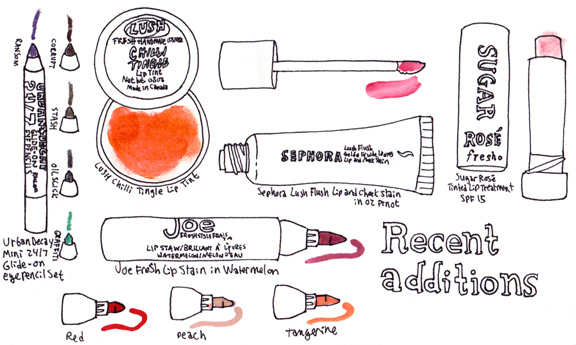
Recent additions to my collection

New make-up sketch! My most recent purchase was Urban Decay's Mini 24/7 Glide-on Eye Pencil Set -- Darks from Sephora, using a gift card I got for Christmas. 

I have the oily Asian mono-lid thing so despite my best efforts most eyeliners crease and migrate in short order. These mini pencils are exceptionally creamy and once they set actually stay on for a decent amount of time! They're a great base for eyeshadows, too. There is a second set of Brights, but "Corrupt" is in both sets. Why, Urban Decay? Whyyy? I don't think I'll pick up that other set anyway because I'm not a fan of blue eye make-up. These mini pencil sets are terrific because you get to try a bunch of different colours for a great price (basically the price of one full-size pencil!).  

My sister got me LUSH's Chilli Tingle Lip Tint for Christmas. It's a fabulous strong orange colour. It's translucent but the colour is surprisingly pigmented and shows up even on lips that have a colour of their own. Terrific product and a wholesome ingredient list. MakeupAlley, my favourite user-generated review site, loved it too! Sadly it was limited edition over the holidays and no longer available. 

A little while back I picked up Sephora's own Lip & Cheek Stain. Another well-received product at MakeupAlley (I never buy cosmetics unless I've done my research there first!). I recently started getting into lip stains because I wanted colour that wouldn't come off while I was out drinking bubble tea with my friends :P. This lip stain is a jelly that you can layer on to achieve your desired saturation. It can go on unevenly, but I think its texture and translucency helps it look a lot more natural than some of the super-strong lip stains out there (like the Joe Fresh ones I picked up, which I love for being so crazy-pigmented!). 

I got my first Joe Fresh Lip Stain (in Watermelon) last autumn. It was $6 at a Loblaws SuperStore. Like I said, this stuff is darn powerful. MakeupAlley likes it too, although because Joe Fresh is a Canadian brand that is just starting to make its way into the US there aren't as many reviews of their products. This is a  lip stain like my old Tokidoki ones and Josie Maran's. The price of these thing simply can't be beat. Mine hasn't dried out yet, which I hear is a common complaint about this marker-style delivery system. Last week I picked up Red, Peach, and Tangerine and they are all great colours. Peach is particularly nice if you don't want a super-strong lip stain colour; it's much more natural than the others I have.

Lastly, we have...
Fresh Sugar Kisses Mini Lip Duo is Sephora's latest birthday bonus for their Beauty Insiders. It is my favourite bonus so far. Fresh is a pricey brand, which makes it extra nice to get this little set for free! It looks a heck of a lot like this set, which they are selling for $22.50 USD on their site. Both sets are trial sizes, even. This set is great because you get two lovely smelling lip balms (one lemony and one rose) with SPF 15, one colourless and one with a slight pink tint. The lip balm tubes screw closed and just feel high quality. Be sure to pick this bonus up during your birth month, Beauty Insiders!

Thursday, December 1, 2011

Scentimental Journey

I've been waiting to show this job, it's now on newsstands in the December issue of Best Health magazine! The job was a full page and a half page for their feature article on perfumes -- the coolest part was that Best Health sent me the perfumes so I could actually illustrate the bottles from life. I love love love perfumes and cosmetics, so I was totally psyched. Dream job!

The job was to illustrate ten perfumes but twelve were actually sent (as can be seen by this horrible photo I took!). There were three Jacob Boutique fragrances that all had the same bottles and I was to use one. I love perfume bottles. They are glass sculptures, pieces of art that I can actually afford! Add to that the fact they contain wonderfully complex and unique fragrances and it doesn't get much better than this.

Here's the half page illustration. The art director wanted a scene of a woman getting lost in the perfume she is sampling, being transported back to a wonderful beach vacation with one spritz of a bottle.

I send out postcards and email promos and I enter illustration contests every year; I never expected to generate work from a blog entry! I had posted some make-up sketches on my blog in response to one of Christine from Temptalia's beauty questions and Christine (beauty blogger extraordinaire!) liked the sketches so much she asked to post them on her tumblr and twitter. Jaime over at BellaSugar saw the sketches via Temptalia and contacted me, asking if she could do a feature article of those sketches for BellaSugar. And that's where the Best Health art director found me! Long story short: Social networking works :P.

What's amazing to me is that I visit BellaSugar and Temptalia every day and I am so into what they do -- that made the fact they liked what I'd done about ten times cooler!

Those make-up sketches are looser and more delicate than my usual work, and it was this look that the art director wanted me to emulate. I use watercolour frequently but I haven't used it in my illustrations for many years. That made me a little nervous. I love watercolour but it is an unforgiving medium. One of my college painting profs passed on a saying that goes something like: "Watercolour is an enjoyable medium once you can get past your first three hundred paintings."

I whipped up this up for experimental purposes to see if I could actually pull off a more delicate, watercolour-y look while still having it look like the rest of my portfolio. After that, I felt a lot more confident that I'd be able to create something that would make both me and the art director happy!

Sketches:

The next part of the equation was the perfumes. Fragrantica is my go-to resource for fragrances. They have reviews, notes, and user comments on hundreds and hundreds of perfumes and they post articles about upcoming fragrances and even info about perfume ingredients. You can even do a search for fragrances by selecting specific notes and the site will automatically generate a list of fragrances that have those notes in them!

Here is a list of what I was sent:

Balenciaga L'Essence
Burberry Body
Calvin Klein Euphoria
Clean Skin
Clinique Aromatics Elixir Solid Parfum necklace
Jacob Tres Chic
Jacob Joie Vivre
Jacob Classic
Kenzo Flower Tag
Lancome Tresor Midnight Rose
Oscar de la Renta Live in Love
Prada Candy

I used Fragrantica to research these fragrances and I sketched three elements contained in each one. Here are the two sketches I submitted for the full-page of fragrances:

The art director requested a more streamlined version for the final so only a few perfume notes ended up making the cut. I'm quite fond of the illustrated notes but I can see that they make the page look fairly cluttered. More space was required to put in the captions!

One more fragrance resource for other perfume enthusiasts: Katie Puckrik puts up entertaining and informative perfume reviews on YouTube, I highly recommend them to any fellow "fumeheads" (as Katie calls us!).

I did a lot of experiments to decide what kind of line quality I wanted to use for the perfume bottles. From left to right: Tech pen, thin brush, thicker brush, nib. I ended up going with the thin brush.


I tried a variety of colour treatments, some of which are pictured here. You may notice that the Prada Candy bottle in the final illustration wasn't this one; I ended up drawing a it from a different angle, an angle I thought worked better for the composition. Here are some of the other bottle sketches -- you'll notice the same thing, sometimes I didn't use my first version!

Compare the pencil sketches and the inked drawings -- some of the bottles have most definitely gotten a little restless and turned themselves around :P.


This job was most definitely a "scentimental" journey. It was a lot of work but totally worth it. I'm proud of what I managed to accomplish, and how I created two portfolio pieces that are quite different from my other stuff but still somehow familiar. Many thanks to Stephanie at Best Health for seeing potential in those make-up sketches and for giving me the opportunity to work a little outside of my comfort zone. And I can't thank Christine from Temptalia and Jaime from BellaSugar enough for sharing my illustrations with their readers! I love what you ladies do. Keep up the good work!

Tuesday, July 12, 2011

Urban Decay Naked palette vs. my collection


Another quick little make-up sketch this one for research and comparison purposes!

Argh. I'm not made of stone. The first time I saw Urban Decay's famed "Naked" palette in-store at Sephora, I jumped on it like a cat onto a catnip mouse. And I had gift cards so I only really paid $20 for it! I've played around with it a bit and whipped up this chart on the colours it has vs. the colours I already have, and... The results are inconclusive.

It seems like one way or the other I have dupes for half of the colours already, but they're spread across a number of places and here they are in one easy-to-travel-with palette. And the pigmentation and texture are nice... Basically, I'm trying to convince myself not to return it to Sephora and get a nice big gift card back.

Any thoughts?

Monday, June 27, 2011

Sephora's conspiracy -- CUTE rollerballs!


The tiny sideways writing are fragrance notes I jotted down for my own purposes. Apologies for the distracting chicken-scratch!

Honestly, Sephora seems to have this weird agenda where they seek to divest me of what little disposable income I have.

I found these adorable tokidoki rollerballs on their site. The second row was other rollerball fragrances I wanted to sample, so far I am in love with Vera Wang's Princess. I feel like I can actually smell a whiff of dark chocolate in it and that sends me over the moon! It's how I imagine someone learning about wine feels when they detect a note of cassis or tobacco for the first time.

Ever since I did that visual inventory of my make-up I have really curbed my craving for buying more of the stuff. Unfortunately, fragrances are ephemeral fancies that can't be documented so easily. And if I sprayed the scents into my sketchbook it would create that cacophony of smells that fashion magazines are so well known for. To further complicate matters, fragrances interact with body chemistry and develop further over time!

Lately I've been wanting to become a connoisseur of something. My tastes aren't all that well developed in terms of alcohol (don't much like the taste), cheeses (stinky ones overwhelm me), coffee (makes me jittery and gives me gut rot), or chocolate (not much of a sweet tooth).

To me, fragrances are incredibly accessible -- Walk into just about any mall that has a department store, Sephora, Shoppers Drug Mart, Body Shop, Lush, etc. and you can get away with spraying testers on yourself for free! I make notes on my iPhone of what I've sprayed where (wrist, elbow, forearm) and then when I get home I look up the fragrances on Fragrantica and Makeupalley to see if I can tease apart the different notes. It is weird to me that the boxes for the perfumes never, ever say what the notes are supposed to be. They always say alcohol and fragrance oil. Thanks, guys! Very unhelpful :P.

I love learning about the different fragrance notes. I love how the bottles are designed to reflect their contents, how a smell can inspire the creation of the physical form to house it. I am intrigued by how a precisely calibrated combination of oils, alcohol, and chemicals can excite my brain and challenge my senses.

And as hobbies go, it's a pretty cheap one. Luckily I don't like about 90% of what I test, which means I don't buy much. I only own three full-size bottles. But each one I test is a learning experience! Last week I tested Dior's Dolce Vita (Shoppers Drug Mart) and immediately hated it. I thought it smelled like curry. I love curry, but I do not want a perfume that smells like it. When I got home I found out that one of the notes in it is cardamom, which was a big "aha!" moment for me :).

Can't wait to see those tokidoki rollerballs at my closest Sephora! I have some giftcards :D.

Tuesday, June 21, 2011

Featured on BellaSugar!


from BellaSugar.com

The internet sure moves fast! BellaSugar saw Temptalia's twitter post yesterday about my make-up images and did a feature slideshow on their site! As a regular visitor of both of those terrific resources, I was so thrilled to see my work catch their attentions.

BellaSugar is my go-to site for beauty news and Christine at Temptalia is my favourite for her in-depth product reviews and video reviews. I heartily recommend both to anyone who loves make-up.

Here's a link to the original blog post, with full details and close-ups of the images (click to enlarge)!

Monday, June 20, 2011

Hobby Time!: Make-up edition

LinkI love make-up. I don't own a lot or even use very much, but seeing new colour palettes, formulations, textures, products and ad campaigns really appeals to my artsy-fartsy sensibilities.

Here's a visual inventory of all my colour cosmetics!


Temptalia is my favourite make-up blog. Christine is always great about showing previews of new collections and reviews and swatches tons of cosmetics each week. Recently she asked her readers two questions: "Have you ever gone on a no-buy?" (moratorium on purchasing beauty products) and "Do you organize your makeup products by brand or product?" I suppose my answer would be that I organize my make-up by drawing them in my sketchbook and painting them with watercolours!

Whenever I complete an illustration assignment I always get this urge to treat myself. I decided that by documenting what I already have, I could assuage these cravings. And it's worked, at least for now! I'm not sure I'll go on a formal no-buy, but I am content to draw and paint the stuff I want instead of purchasing it. Case in point:

Urban Decay's Naked palette is legendary for being hard to find at Sephora. Whenever I visit a Sephora location I look for it and I've never, ever seen it in stock. Which is probably a good thing because it's not cheap. When you price out how much each individual colour would be if you bought it separately it's a steal, but it's still $48 USD. Temptalia gave it a rare A+ rating which made me want it even more. But sketching it somehow made me want it less -- I feel like after I've studied a product and painted my little illustration of it, I somehow own it already. Doing the visual inventory of the eyeshadows I already have made me realize I already have some similar colours.

One year my sister was going to get me a make-up palette for xmas, so I started doing a ton of research. I read reviews on MakeupAlley to see how highly rated the individual components were. I went to Sephora to see the products in person. I sketched them, and here were four of the contenders:


In the end I settled on Urban Decay's Urban Arsenal, which was similar to the one pictured here (Urban Survival Set) and I'm still very pleased with my choice. Here's the winner!


I've started to share more of my hobbies and personal work on my blog, I hope people find it interesting -- I'd love to hear from you!

**EDIT:
I forgot to mention! In the first two pics of the post I actually swatched my make-up on the pages :P. For the powdery products I dabbed a tiny bit of white craft glue (dries clear) onto the paper then blotted a fully-loaded eyeshadow brush onto the glue. There was glitter, shimmer, and pigment all over my dining table. The brush wasn't harmed during the production of the swatches as the glue grabbed the pigment first. And the glue is somewhat water-soluble.

I was actually daydreaming that a simple field kit could be constructed with a glue stick, eyeshadow brush, and notepad. Don't know how much sales associates would appreciate that, but it'd be a fun way to take a swatch of colour home to compare it to the rest of your collection!