Friday, October 28, 2011

Happy Halloween!


Happy Beer-o-ween! This is a group of spots I did for Alibi magazine's Hallowe'en issue, for their "Bewitching Brews" feature. A really fun, weird concept! I enjoy doing a series of spots, though I don't often get the chance (I did a series of twelve spots for Alibi before, but those were in black and white). It's a fun challenge to use the same colour palette in different ways and to include certain design elements to balance them out (lightning, bats, smoke, moon n' stars).


Sketches:

I love everything about Hallowe'en. I love the shapes and colours of all the different kinds of candy, roasted pumpkin seeds, the iconic look of classic monster movies (check out James Rolfe's Cinemassacre Monster Madness for some great reviews of horror movies new and old!), trick-or-treating, those hella heavy UNICEF boxes we wore around our necks to collect people's change... Later on I went to artsy college so the fun became creating awesome costumes using the paint, cardboard, glue, and duct tape that we already had on hand. One year I was Kabuki (from a comic by David Mack) and another year I went as Gogo Yubari from Kill Bill.

Here's the cover I did a few years back for the Weekly Alibi's Hallowe'en issue. I got to illustrate those fabulous classic movie monsters and I couldn't have been more pleased to do it!

When I was a kid my mom sewed our costumes so we always had sturdy, quality stuff. The piéce de resistance was a witch's hat. My mom bought some sort of thick, synthetic fibre string that she unravelled to make a long, tangly bird's nest of witchy hair that she sewed into the hat's brim. My classmates were always impressed!

Pictured below: Sleeping Beauty fairy godmother costume (modelled by my sister), witch costume (modelled by me, and sewn large enough to accomodate the inevitable winter jacket -- This is Canada, after all!)

Happy Hallowe'en!

Wednesday, October 19, 2011

"Lucille" on Jazz and Draw


"Jazz and Draw" is a blog created by Philippe Debongnie. It's a great space where jazz and the images that were inspired by it can be enjoyed together. Phillippe has featured my illustration "B.B.'s Lucille" on his blog, and I couldn't be happier! If you love music and art, visit "Jazz and Draw" and tell M. Debongie I saw hi!

Friday, October 14, 2011

B.B.'s "Lucille".


I'm excited to report that I'm collaborating with author Ryan W. Cox and whiz-bang illustrators Zela Lobb, Dushan Milic, and Andy Potts on a project! It's called "A Circus Mind" and it's pretty darn cool. Ryan's written some poems inspired by great songs, musicians, and bands. One of which, "B.B.'s Lucille" I've had the privilege of illustrating.

Here's the story of B.B.'s Lucille, as told by B.B. himself. It's lovely stuff.


In the sketch I had ghostly images of two men fighting in the smoke, but I decided to simplify the image.

Ryan's book has many, many poems in it so it will be awhile before the project is done -- But it's shaping up to be quite a journey!

Tuesday, October 4, 2011

Pop-o-matic Bubble: Shameless magazine cover


Who remembers "Trouble" the game with the Pop-o-Matic Bubble(tm?)? I created this cover for Shameless magazine, a grassroots Canadian publication for young women and trans youth who are active in arts, culture, and current events.

I used Trouble to illustrate the game of Canadian politics, where politicians are racing around in circles stomping on each other in order to grab seats and "win". Our girl here is a bit tired of the rigmarole and is getting set to burst the bubble.


Sketch!

Click to enlarge and see the silkscreen-y glory

And here's a close-up to show the handcrafted silkscreeniness of the piece. I hope some of the detail shows up on the cover!

This is a cover I did for Shameless a number of years ago. I was so pleased when the editor got in touch with me to do another cover for them! It's interesting to see how my work has changed over the years. I've started using a warmer colour palette and my technical skills with silkscreen printing have vastly improved. I think my drawing has gotten a bit better, too!

I am glad I got the chance to work for Shameless again and to revisit my first job with them. Seeing how I've evolved over the years is very motivating. I'm gonna keep on truckin'!

Tuesday, September 27, 2011

Macleans obit illo: An Active Life


A Macleans obit frame! The subject (Kassandra Marie Kaulius) loved all sports and softball in particular. She played for the Surrey Storm in Vancouver and eventually coached for them, too. She went to college on a full scholarship and continued to play and coach softball even as she worked to save for school. After she died, her parents set up a scholarship fund in her name, though the Surrey Storm. Because softball was such a major part of her life, I made it the overarching theme of the frame and used a softball diamond for the actual shape.

Kassandra was a terrific athlete, but off the field she loved to glam it up; her boyfriend Cody said that this transformation from one to the other and back again "was the most beautiful thing about her". I included a lipstick because I wanted to celebrate his love for her.

I really enjoy incorporating bits like that, those little details that make up a person. I put in a BMW car key because after she returned home from the full scholarships she'd had at American colleges she worked hard to save for school in Canada and buy a car, making all the payments herself. All the while she was coaching and playing softball in her spare time. She was intent on paying off the car completely before moving in with her boyfriend.

She and Cody enrolled at the University of the Fraser Valley (the stems and leaves motif on the frame echoes the logo of that school) with plans on becoming teachers. Cody was going to propose to her this summer. That's why I played up home plate as a diamond ring. Kassandra had chosen to come home, and she had the future in front of her.

Friday, September 23, 2011

New t-shirt! Tree-shirt?


Craig and I recently did a road trip to Vancouver. We met up with yet another friend we met in World of Warcraft (five so far, three to go!) and to commemorate the occasion I made him this t-shirt! Being handy with silkscreening has its advantages :).

A little while back my work was featured on popular WoW news site WoW Insider. It showcases a bunch of the other Warcraft stuff I've done, as well as a lengthy interview about my process and how I came to be a freelance illustrator.

I mention in the interview that for my fan art creations I don't draw the designs (my freelance professional work is 100% me, though!), but I do fiddle with my reference images a good deal before they are ready for silkscreen printing. Here is the picture I used for this t-shirt. It's all about picking out the right lines and emphasizing the shapes to make sure it prints clearly, not to mention processing the screen properly so the design transfers well. Especially all those picky little leaves!

I've done a couple non-Warcraft related t-shirts, to see those and more, click here!

Monday, September 19, 2011

9/11 + Haiku Contest


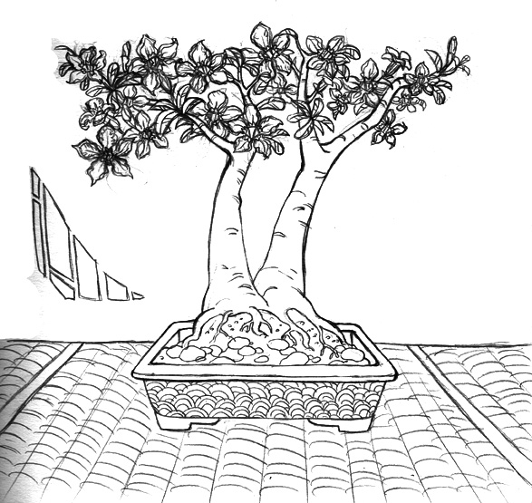
Here's the cover image I did for The Weekly Alibi's 9/11 commemorative issue + 19th annual haiku contest. I can't take credit for the terrific idea (props to the art director), but I know one when I see one! Alibi covers are always fun to do because it's a large (around 10x10") prominent (cover!) space for illustrations. At first I had the bonsai tree much taller -- I planned to have the "alibi" name right across the foliage, but probably for legibility's sake the art director requested that the bonsai be... pruned! (heh). 


This is a close-up of the piece, it's all hand-mixed colours and silkscreened onto paper. The original pretty much looks exactly like this! If you look closely in the background you can see how it has an odd, irregular texture. That's because I used fairly thick ink and when you pull the paper off the screen the ink clings to the paper creating a bumpy, raised surface. I'm pleased with the textured background because it really does look like a wall! I used process magenta and flourescent green for the flowers and leaves because those inks are transparent and I knew they would overlap the background colours nicely. 


And here's a blast from the past! This is the cover I did for the very same haiku contest for Alibi a few years back. 

That cover, as it was published:

Making haiku art
For Alibi is great fun
Illustration rules!