Thursday, October 31, 2013

CUFF Documentary Film Festival Poster

Click image to see as intended!

Here's something a little bit different. A combination of the art I'm doing for my computer game and my freelance illustration gig -- For the Calgary Underground Film Festival Documentary Film Festival!

The sixteen colours I used form the classic EGA palette:

Detail interior shot (click the image to enlarge):

I managed to squeeze in one of my favourite posters, the lovely "Le Chat Noir" by Théophile Alexandre Steinlen:


Sketch!

This was the first time I've used this technique for illustration. What do you think? :D

-- Julia
Portfolio site

Friday, October 25, 2013

Cozy little bar

Click to enlarge and see how it's supposed to look!

What better way to wind down after dinner but with some brandy and a nice cigar? I actually have no idea as I've had neither, but I've read plenty of books!

I wanted to do an Art Deco style bar, as I imagine Margot the maple syrup heiress would want to have the latest and most fashionable furnishings. She's the reason a lot of the rooms have framed Art Nouveau posters. Trying to class up a rustic lodge!

I feel like this room is overwhelmingly red so I may change up some of the colours. Maybe make the red door green. I keep telling myself I'll revisit all the other rooms I've done so far to spruce 'em up -- Trying not to linger forever tinkering with each and every pixel :P.

Speaking of posters, here's the one I chose for this room:

This week I've done this bar-type room (lounge?), a powder room, and I'm currently working on the parlour. I'm not posting everything because I want there to still be a sense of discovery when people play my game!

To see the other rooms and game art I've posted click here!

-- Julia
Portfolio site

Thursday, October 17, 2013

Latest Macleans out now!

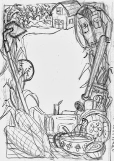
Tomato soup, onions, and corn. I always perk up when there's food involved in my work! This week the subject was a proud farmer from a family of farmers. I had fun drawing the stages of growing corn, from the fields to the stalks to the corn growing on the stalks to the harvested delicious result.

iPad version:
It's a fun challenge to use elements from the frame to create these skinny horizontal compositions. 

Sketch!

This one ended up being fairly close to my original sketch. I ended up creating more space in the middle -- It's my natural tendency to try and fill every nook and cranny!

-- Julia
Portfolio site

Thursday, October 3, 2013

Wood-panelled Dining Room

Click image to enlarge.

Now that I'm finished the upper level of my mysterious lodge, I'm working on the main level. It's hard to resist the urge to include all the rooms that are on a standard Clue board :P. I mean, I've already got a conservatory, kitchen, dining room, and study done, and I'm currently working on a games room / billiard room. Should I just succumb to this desire and do the library, lounge, and hall?

I haven't been posting all the rooms I've done (although here's what I've posted so far) because I want there to be new places for people to see when they play my game!

-- Julia
Portfolio site