Wednesday, December 4, 2013

Come into my parlour

Click image to see as intended!

The parlour was considered the best room of the house, where the finest furniture, art, etc. would be presented. This is because it was the room one would take visitors. It was considered a luxury to have a room solely for entertaining, as a few hundred years ago most folks lived in houses that were only one or two rooms. Wikipedia has a great entry that delves into this in more detail!

So naturally, my parlour is decorated with a plush settee, an elegant carpet, gilt wallpaper, a Tiffany floor lamp, a bronze Art Nouveau figurine, and one of my favourite Lawren Harris oil paintings. On the table we've got an exquisite crystal vase with a matching candy dish (containing Jordan Almonds. I saw Jordan almonds being sold in the craft section of Wal-mart alongside glitter and fabric paint, not the grocery section, which is everything you need to know about Jordan Almonds. They have a fascinating history, I might do an illustration about them!).

I like how fussy this room turned out. I'm thinking Harry Potter's Dolores Umbrage would've loved it! Maybe I should add some decorative plates with kittens on :P.

Here's the oil painting I've converted into pixelly glory:

The bronze figurine I used as a reference:

-- Julia
Portfolio site

Friday, November 29, 2013

Macleans Latest

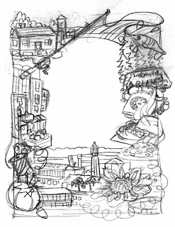
 When I'm making these illustrations for Macleans I like to include places the subject of the obituary lived and worked. This hard-working lady got one of her first Canadian jobs selling fruit in Kensington Market. I was happy to include a little slice of Toronto in this piece! The bottom centre of the illustration is a bit of La Grange, Guyana, the port near where the subject grew up.
 
I also enjoy small town "Welcome to -" signs (upper right). They're usually these lovely distinctive painted wooden landmarks. One of my past Macleans illustrations was composed mostly of signs and local landmarks!
 
Sketch:
-- Julia


Tuesday, November 26, 2013

Hardtack

Here we go... Another illustration based on food, although hardtack barely qualifies! (Here are some other food-related illustrations I've done).

Hardtack is flour and water baked into a nigh-invulnerable biscuit. If you want to get fancy you can add salt or even shortening, but real hardtack is almost more of a building material than a foodstuff. It's calorie-dense, fairly light, and will keep for ages if stored properly (historically, improperly stored hardtack was plagued by weevil larvae yet still eaten; best not to think about this). 

Here is a recipe for you to make your own hardtack. After you've finished baking it, the author of the recipe advises you keep it out in the open air for a few days. "He writes "When it has the consistency of a brick, it is fully cured." Bon appétit :P.  

Because of its convenience hardtack remains a mainstay of sailors, soldiers, and explorers. Ancient Egyptians baked an early form of hardtack using millet. Romans soldiers had buccellum. King Richard the Lionheart took it with him on Crusade. Royal Navy seamen gnawed on ship's biscuits and Civil War soldiers on both sides ground their teeth against hardtack's unyielding surface. Japanese soliders ate wee biscuits called kanpan, while Russian Navy have galeta in their rations. Civilians in Alaska and Hawaii (both remote areas that benefited from hardtack's shelf-stability) enjoy hardtack as a snack food, and explorers still bring it with them on expedition. 

Inked version. I made a few adjustments, such as the size of the Egyptian's millet loaf on the far left (looks more like a cracker than a loaf here) and the kanpan in the Japanese soldier's hands are way too big.

Pencil sketch:

Preliminary sketch. I was originally going to have weevil larvae poking out of the main bit of hardtack in the middle of the background, but good taste prevailed! 


 Hardtack. Source: Wikipedia


-- Julia

Wednesday, November 6, 2013

Latest latest Macleans out

Latest for Macleans! Google really is my best friend when making these illustrations -- I can easily look up town landmarks, schools, and anything else that might have been a part of a person's life. It feels good to include personal details that could mean something to family and friends.

iPad version:

Sketch:

-- Julia
Portfolio site

Thursday, October 31, 2013

CUFF Documentary Film Festival Poster

Click image to see as intended!

Here's something a little bit different. A combination of the art I'm doing for my computer game and my freelance illustration gig -- For the Calgary Underground Film Festival Documentary Film Festival!

The sixteen colours I used form the classic EGA palette:

Detail interior shot (click the image to enlarge):

I managed to squeeze in one of my favourite posters, the lovely "Le Chat Noir" by Théophile Alexandre Steinlen:


Sketch!

This was the first time I've used this technique for illustration. What do you think? :D

-- Julia
Portfolio site

Friday, October 25, 2013

Cozy little bar

Click to enlarge and see how it's supposed to look!

What better way to wind down after dinner but with some brandy and a nice cigar? I actually have no idea as I've had neither, but I've read plenty of books!

I wanted to do an Art Deco style bar, as I imagine Margot the maple syrup heiress would want to have the latest and most fashionable furnishings. She's the reason a lot of the rooms have framed Art Nouveau posters. Trying to class up a rustic lodge!

I feel like this room is overwhelmingly red so I may change up some of the colours. Maybe make the red door green. I keep telling myself I'll revisit all the other rooms I've done so far to spruce 'em up -- Trying not to linger forever tinkering with each and every pixel :P.

Speaking of posters, here's the one I chose for this room:

This week I've done this bar-type room (lounge?), a powder room, and I'm currently working on the parlour. I'm not posting everything because I want there to still be a sense of discovery when people play my game!

To see the other rooms and game art I've posted click here!

-- Julia
Portfolio site

Thursday, October 17, 2013

Latest Macleans out now!

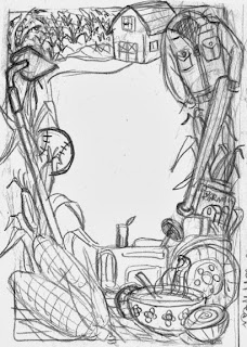
Tomato soup, onions, and corn. I always perk up when there's food involved in my work! This week the subject was a proud farmer from a family of farmers. I had fun drawing the stages of growing corn, from the fields to the stalks to the corn growing on the stalks to the harvested delicious result.

iPad version:
It's a fun challenge to use elements from the frame to create these skinny horizontal compositions. 

Sketch!

This one ended up being fairly close to my original sketch. I ended up creating more space in the middle -- It's my natural tendency to try and fill every nook and cranny!

-- Julia
Portfolio site

Thursday, October 3, 2013

Wood-panelled Dining Room

Click image to enlarge.

Now that I'm finished the upper level of my mysterious lodge, I'm working on the main level. It's hard to resist the urge to include all the rooms that are on a standard Clue board :P. I mean, I've already got a conservatory, kitchen, dining room, and study done, and I'm currently working on a games room / billiard room. Should I just succumb to this desire and do the library, lounge, and hall?

I haven't been posting all the rooms I've done (although here's what I've posted so far) because I want there to be new places for people to see when they play my game!

-- Julia
Portfolio site

Wednesday, September 25, 2013

Macleans' Latest

Here's my latest for Macleans! This fellow was a loving father, grandfather, great-grandfather, and great-great-grandfather. He grew up during the Depression and picked blueberries to can for his family. He met his sweetheart in the 60s -- she with a beehive hairdo, he with an Elvis pompadour. Much later, when the couple was caring for ten grandchildren, he would make them porridge and toast every morning before school. And even later than that, he'd take his beloved wife to bingo every day. 

I always jump at the chance to illustrate food. I'm fascinated by what people eat and why they eat it. I have the official Game of Thrones cookbook. My personal work often centres around food. I'm a little obsessed!

iPad version:

Sketch:
 This one ended up very close to my original sketch. This isn't always the case :P.

-- Julia
Portfolio site


Friday, September 13, 2013

Renovated Conservatory

Click the image to see as intended and not moire'd weirdness!

After I drew up a floor plan for my mystery house, I realized the conservatory as I had it wasn't going to work. I flipped the room around and redid the whole thing. Kept the comfy couch, side table, garbage can, and lamp. Waste not want not -- Furniture isn't cheap!

I'm happy I was able to do a contrasting-tile floor for the conservatory. A childhood of staring at my sister's Clue board game taught me that conservatories have tiled floors. 

I'm also pleased do to some moodier lighting. I might dial up the moodiness in some of the other rooms. Gives a nice, eerie ambience :). 

The old conservatory:
I enjoy the "Le Chat Noir" poster. Hopefully I can squeeze it into another room! It's hard to stop tinkering with all the rooms and improve them as I get better at this type of art. Onwards and upwards!
-- Julia

Wednesday, September 4, 2013

Latest Macleans illo on newsstands!

I'm not sure how I would do these illustrations if I didn't have access to the wondrous internet! I try to do as much research as possible to get visual references for places and things that are mentioned in the articles. 

For example, the fellow who was in this frame met his future wife at the Millionaire Drive Inn. I was able to find a picture of its iconic sign (the classy waiter/chef with the frosty mug and burger) and include it in the illo! Another subject was an author and I found the cover art for some of her older, less known works and incorporated those into the frame. And for a young track star, I went to the Nike website and found the shoes she was wearing in her photo. 

The spot illustration for the iPad version: 

Sketch:
Yeah, my bagpipe was pretty rough. And let's not consider that sad-looking car :P.

-- Julia
Portfolio site

Friday, August 23, 2013

Wedding invite for a friend

I was happy to get the chance to do a dual-portrait wedding invitation for an old high school friend. The idea was to have them look like they were riding on top of a double-decker bus with a favourite landmark behind them.

Best wishes to them!

-- Julia
Portfolio site

Friday, August 16, 2013

Two new rooms. Introducing wallpaper!


The art for my adventure game is going full steam ahead. Here's a tea room / book nook I did! I looked it up and they indeed had hot plates in the early-ish 1900s :P.

When I was back in Toronto I was marvelling at the wallpaper in my parents' house. They first put it up when they moved into that house almost forty years ago and I've loved it for as long as I can remember. Not many people use wallpaper any more and I think that's a shame! This inspired me to add wallpaper to some of the rooms I've been creating. 

And here's the poster in the tea room I reproduced with glorious pixels. I get a real kick out of doing that!

Check out this fairly garish bathroom I've done. Again, another Art Nouveau poster on the wall:


The hair was pretty challenging...

-- Julia

Wednesday, July 31, 2013

Pet memorial stones


 My uncle's dog died suddenly and my mom wanted me to paint a memorial stone for him like ones I've done before. After I'd completed this stone (for Mei, who died in July)  my mom wanted me to restore Leo's stone, which looked like this:

I painted this just four years ago! Poor thing :(. It hadn't occurred to me to spray these things with a coat of clear acrylic. I got the idea while painting Mei's stone, so now I had to do the others!


Here's Leo's stone all nice and restored. After I took this photo I sprayed the stone with the clear acrylic so hopefully it'll last a little longer this time.

Here are all the cats that have come before! Poor Sparky died first, seven years old or so. She had heart problems. The unnamed cat we called Shiro, he was a feral cat that hung around. He had the loveliest colouring. We managed to capture a couple of his siblings while they were still young and take them to an animal shelter. While we like cats, huge feral colonies aren't that great if you love birdwatching! 
None of the other stones were as worn away as Leo's. But now with the protective coat on top, none of them will be!

-- Julia

Portfolio site

Wednesday, July 24, 2013

A lady's shoe in fourteen pixels

Here's a lovely walk-in closet to accompany the boudoir I made! Everything's a work in progress but it feels really good to be slowly developing the entire house. The first rooms took ages to create but I think I'm finally getting a handle on the process.

The matching boudoir:

Today I found out about an awesome artist who's been using Microsoft Paint to create works of art. Hal Lasko is 97 years old and used to be a graphic designer (he specialized in creating letterforms by hand). He's long been retired but still uses his discerning eye to produce terrifically pixellicious work. His family showed him how to use Paint a few years ago but he really took to it! The program's ability to magnify segments of an image for him to work on help tremendously because his vision is failing. Here's a video of this inspiring fellow!

-- Julia
Portfolio site

Wednesday, July 17, 2013

Macleans latest on newsstands!

The subject of this week's illo had a newly discovered talent for baking, beloved pet bearded dragons, and always smelled like campfires. He worked at a restaurant called Gracie Joe's -- I managed to find their logo so I could put it on the bass drum. Drumming was his first passion and baking was his second, so I wanted to combine the two. 

Here's the iPad version:


As you can see, the sketch was pretty different from the final piece :P. Not much room left in the centre first of all, and I decided not to include the building on the lower right, which is a landmark in Thailand. I was planning on contrasting the lighthouse (a local landmark) with the Thai building, but the whole thing ended up being too cluttered.

I kinda like it, too bad it didn't make the cut!

-- Julia