Monday, June 27, 2011
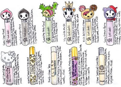
Sephora's conspiracy -- CUTE rollerballs!
The tiny sideways writing are fragrance notes I jotted down for my own purposes. Apologies for the distracting chicken-scratch!
Honestly, Sephora seems to have this weird agenda where they seek to divest me of what little disposable income I have.
I found these adorable tokidoki rollerballs on their site. The second row was other rollerball fragrances I wanted to sample, so far I am in love with Vera Wang's Princess. I feel like I can actually smell a whiff of dark chocolate in it and that sends me over the moon! It's how I imagine someone learning about wine feels when they detect a note of cassis or tobacco for the first time.
Ever since I did that visual inventory of my make-up I have really curbed my craving for buying more of the stuff. Unfortunately, fragrances are ephemeral fancies that can't be documented so easily. And if I sprayed the scents into my sketchbook it would create that cacophony of smells that fashion magazines are so well known for. To further complicate matters, fragrances interact with body chemistry and develop further over time!
Lately I've been wanting to become a connoisseur of something. My tastes aren't all that well developed in terms of alcohol (don't much like the taste), cheeses (stinky ones overwhelm me), coffee (makes me jittery and gives me gut rot), or chocolate (not much of a sweet tooth).
To me, fragrances are incredibly accessible -- Walk into just about any mall that has a department store, Sephora, Shoppers Drug Mart, Body Shop, Lush, etc. and you can get away with spraying testers on yourself for free! I make notes on my iPhone of what I've sprayed where (wrist, elbow, forearm) and then when I get home I look up the fragrances on Fragrantica and Makeupalley to see if I can tease apart the different notes. It is weird to me that the boxes for the perfumes never, ever say what the notes are supposed to be. They always say alcohol and fragrance oil. Thanks, guys! Very unhelpful :P.
I love learning about the different fragrance notes. I love how the bottles are designed to reflect their contents, how a smell can inspire the creation of the physical form to house it. I am intrigued by how a precisely calibrated combination of oils, alcohol, and chemicals can excite my brain and challenge my senses.
And as hobbies go, it's a pretty cheap one. Luckily I don't like about 90% of what I test, which means I don't buy much. I only own three full-size bottles. But each one I test is a learning experience! Last week I tested Dior's Dolce Vita (Shoppers Drug Mart) and immediately hated it. I thought it smelled like curry. I love curry, but I do not want a perfume that smells like it. When I got home I found out that one of the notes in it is cardamom, which was a big "aha!" moment for me :).
Can't wait to see those tokidoki rollerballs at my closest Sephora! I have some giftcards :D.
Sunday, June 26, 2011
Happy Belated Father's Day card
I mailed this card to my dad on Monday, July 13th. Ample time, I figured, for it to get to where it needed to be! Hopefully Canada Post will eventually get back on track. Too bad I put the date in the lower right-hand corner, otherwise this could've been a really early Father's Day 2012 card :P.
I painted this to commemorate my relatives visiting from Japan (I made them Japanese bobtails!), which happened near Father's Day. They are my mom's siblings and she hadn't seen them in years. Funnily enough, they were in Ottawa when my National Post illustration was published -- So my parents got to show it to them! Very cool.
Best of luck to everyone else who's been inconvenienced by the postal strike.
Tuesday, June 21, 2011
Featured on BellaSugar!
from BellaSugar.com
The internet sure moves fast! BellaSugar saw Temptalia's twitter post yesterday about my make-up images and did a feature slideshow on their site! As a regular visitor of both of those terrific resources, I was so thrilled to see my work catch their attentions.
BellaSugar is my go-to site for beauty news and Christine at Temptalia is my favourite for her in-depth product reviews and video reviews. I heartily recommend both to anyone who loves make-up.
Here's a link to the original blog post, with full details and close-ups of the images (click to enlarge)!
Monday, June 20, 2011
Hobby Time!: Make-up edition
I love make-up. I don't own a lot or even use very much, but seeing new colour palettes, formulations, textures, products and ad campaigns really appeals to my artsy-fartsy sensibilities.
Here's a visual inventory of all my colour cosmetics!
Temptalia is my favourite make-up blog. Christine is always great about showing previews of new collections and reviews and swatches tons of cosmetics each week. Recently she asked her readers two questions: "Have you ever gone on a no-buy?" (moratorium on purchasing beauty products) and "Do you organize your makeup products by brand or product?" I suppose my answer would be that I organize my make-up by drawing them in my sketchbook and painting them with watercolours!
Whenever I complete an illustration assignment I always get this urge to treat myself. I decided that by documenting what I already have, I could assuage these cravings. And it's worked, at least for now! I'm not sure I'll go on a formal no-buy, but I am content to draw and paint the stuff I want instead of purchasing it. Case in point:
Urban Decay's Naked palette is legendary for being hard to find at Sephora. Whenever I visit a Sephora location I look for it and I've never, ever seen it in stock. Which is probably a good thing because it's not cheap. When you price out how much each individual colour would be if you bought it separately it's a steal, but it's still $48 USD. Temptalia gave it a rare A+ rating which made me want it even more. But sketching it somehow made me want it less -- I feel like after I've studied a product and painted my little illustration of it, I somehow own it already. Doing the visual inventory of the eyeshadows I already have made me realize I already have some similar colours.
One year my sister was going to get me a make-up palette for xmas, so I started doing a ton of research. I read reviews on MakeupAlley to see how highly rated the individual components were. I went to Sephora to see the products in person. I sketched them, and here were four of the contenders:
In the end I settled on Urban Decay's Urban Arsenal, which was similar to the one pictured here (Urban Survival Set) and I'm still very pleased with my choice. Here's the winner!
I've started to share more of my hobbies and personal work on my blog, I hope people find it interesting -- I'd love to hear from you!
**EDIT:
I forgot to mention! In the first two pics of the post I actually swatched my make-up on the pages :P. For the powdery products I dabbed a tiny bit of white craft glue (dries clear) onto the paper then blotted a fully-loaded eyeshadow brush onto the glue. There was glitter, shimmer, and pigment all over my dining table. The brush wasn't harmed during the production of the swatches as the glue grabbed the pigment first. And the glue is somewhat water-soluble.
I was actually daydreaming that a simple field kit could be constructed with a glue stick, eyeshadow brush, and notepad. Don't know how much sales associates would appreciate that, but it'd be a fun way to take a swatch of colour home to compare it to the rest of your collection!
Wednesday, June 15, 2011
Monday, June 6, 2011
My Sixteen Favourite Colours
Here's my first try at the EGA-look! Stuff is kind of giant compared to the character :O. Click the image to see it in all its blocky majesty!
I'm a pretty big computer game geek. Not newer games, but the games that happened in the sweet ol' days of EGA and VGA. Old school Sierra and LucasArts adventure games are a major inspiration of mine. I have a particular love for EGA, which was a glorious sixteen colour palette. The sixteen colours you see above were all those companies needed to create some of my favourite computer game art of all time: Colonel's Bequest, Quest for Glory II: Trial by Fire, Monkey Island 1, King's Quest 3 and 4... The Colonel's Bequest particularly had some of the loveliest pixel-painting of any of those adventure games.
Every time I watch Youtuber hercrabbiness's Let's Play of Colonel's Bequest I get so psyched to create a game like that. With a utility called Adventure Game Studio, this wouldn't be an impossible dream!
My silkscreen work has always been somewhat influenced by those computer games I enjoyed as a kid. I love sharp lines (anti-aliased blurriness makes me angry!), limited colour palettes, and the technique of using coloured half-tone screens to create intermediate colours.
Here's my other digital stuff, but my love for EGA is so great that I think I'll be redoing the character stuff I did in VGA with EGA!
Thursday, June 2, 2011
The Month Ahead: June -- National Post Arts & Life
June is when things really start getting nice. Windows can be left open at night, but you're not sweating your skin off like in July and August. As someone who's only happy between sixteen and twenty-three Celsius, June is as good as it gets.
And yes, I realize there are balmy places that exist perpetually in the "nice zone" where I could live forever content, but I'm a Canadian, dang it, and it's my birthright to complain about the weather 99% of the time!
I submitted four sketches for this National Post job. I knew right off the bat that I wanted to do something pretty-pretty. That's just how June makes me feel. Pretty-pretty flower girliness. I wanted some Art Nouveau to happen. I've always listed Art Nouveau as an inspiration but I've never gone whole-hog for that look. I love curly, fairytale-impractical Art Nouveau furniture. That stuff can't be made in a factory! Pixies made those chairs!
The first sketch was inspired by John R. Neill's glorious Oz illustrations. Wood nymph-y, flowery (honeysuckle and rose are June's flowers), very much like the panel on a dressing screen. I badly want to own a dressing screen some day. So chic. Pearls are June's gemstone, so those are in there as well.
Here's another sketch for the job. This time I focused on the Roman goddess Juno, as June was named after her. She's associated with marriage (lots of weddings happen in June, hence the tiered wedding cake in this sketch) and is often pictured with a peacock, staff, and diadem (aka sort of tiara). June is also considered the month of Cancer the Crab, so I worked that astrological sign in there and because the illustration is for the "Arts & Life", I also stuck in a film reel and a book. Again, we've got roses, pearls, and strawberries, all linked to June. I was thinking very Alphonse Mucha for this one.
This is sketch #3. A simpler version of a Juno piece. Sometimes I like to provide an art director with sketches of different complexities so they have a choice to go one way or the other. I had an idea to do one with an ancient Roman pillar to take advantage of the skinny dimensions, but I kinda thought it was looking like the cover of the menu of an Italian restaurant. Juno is usually pictured holding a patera, which is an ancient Roman dish used for drinking. But when I tried to put one in her hand it always looked like she was panhandling.
And here's the winner! A lot of the same elements are repeated here: honeysuckle, rose, pearls, and strawberries. Another common bit across all the sketches was the depiction of the sun -- The day with the most daylight in the year is June 21st.
After art director approval, I enlarged the sketch and then traced it loosely on two pieces of sketchbook paper stuck together with clear packing tape. Why is Scotch tape so expensive? I figure I'm beating the system by buying clear packing tape and using that instead of overpriced Scotch. I re-drew the sketch super-tight, to prep for inking:
And here's the inked version!
And here's how it appeared in the newspaper:
I'm pleased with how the piece turned out. I love the tall, skinny composition. This is the first time I've done freehand type in an illustration and I think it went fairly well! Art Nouveau type seems to have that irregular, organic treatment look that suits me. And I think overall the piece does have an Art Nouveau feel. Not to mention how cool it was that it was published and available everywhere the day after I submitted it. Best of all, the printed size of the illustration was a monstrous 6.3x21.3". It's not often I get a chance to get published that big!
Wednesday, June 1, 2011
National Post: Cover of Arts & Life section
Subscribe to:
Posts (Atom)