Wednesday, February 29, 2012

My latest illustration is on newsstands tomorrow!


I just finished work on the cover for the National Post newspaper's Arts & Life section for their month of March feature! I love doing "The Month Ahead" because they print it at a HUMONGOUS size -- around 6x20"! I mentioned that before in a previous post (I did the same job for their June feature last year -- check it out here) because it's so rare that I get to see my work printed that large and it's a total rush!


Last June I submitted four sketches for the job and I ended up liking one of the other sketches so much I ended up finishing it as a personal piece


This year I also submitted four sketches. One of them won out and you can see the finished product on newsstands March 1!


Which sketch do you think was used?


Monday, February 27, 2012

Daleks love cats on t-shirts


My friends are big Dr. Who fans and cat-lovers, so when this meme came around I couldn't resist creating a series of t-shirts for them as xmas presents! I believe the original drawing is by Lilian Tula, a web designer and creative person (and lover of Dr. Who and cats, evidently!)

I printed with different coloured inks because the tshirts were different colours. I'm particularly pleased with how bright the fluorescent pink turned out because it's a transparent ink, not opaque like the gold. 


Monday, February 20, 2012

Bob Seger Rocks On!

Bob Seger! I did this illustration for the Weekly Alibi to accompany their article on Bob Seger's awesomeness. One of the reasons I love editorial illustration so much is that I get to read articles and learn about stuff. I knew nothing about Bob Seger and his American heartland rocking-ness, his love of Truffaut, and his penchant for jetsetting to and from his concerts. 

Thanks to my "A Circus Mind" collaboration that features even more classic rocking, I find myself drawing a lot of guitars. I'm sure they are horribly inaccurate and occasionally aren't even real guitars, but they have such great shapes and styles that they are mighty hard to resist. 

And here's the sketch! I simplified the final and made ol' Bob more prominent. \m/ (rock n' roll devil hands!)

Tuesday, February 14, 2012

Happy Valentine's Day!

Happy Valentine's Day, everyone! Here's the Neon Genesis Evangelion-themed card I made. It features Dido (the Minamata family cat, as Captain Misato Katsuragi) and Sachiel (the third "angel" in the anime series) making nice, with Tokyo-3 in the background and a heart-shaped AT field in the sky. The words are kinda a rough approximation of "Happy Valentine Day!". 

My boyfriend and I are big fans of Neon Genesis Evangelion -- he's got the entire tv series on dvd in the special metal case with the printed graphics. Excitingly, series creator Hideaki Anno is in the midst of revamping the series and reformatting it into a series of four movies, two of which have already been released and a third is being released this year. We've seen the first two parts so far and although I'll have to see all four to make any decent comparisons, I have to say Evangelion has never looked better. 

Yes, Neon Genesis Evangelion is a giant robot show, but its forays into mysticism and psychology and plain ol' weirdness set it apart in my mind. The angels (crazy alien-looking creatures that are bent on destroying humanity) are all incredibly imaginative and the art is second to none. Give it a shot, it's an anime classic!

I received four LEGO minifigures for Valentine's this year. I'm pretty psyched! I've gotten back into LEGO recently, after I reorganized my collection back home in Toronto. I got Hillside House for my birthday, a terrific 3-1 set; it comes with three sets of instructions so you can build three different house types!

The minifigs come in little plastic tear packages (not blind boxes!) so if you are very dedicated and not self-conscious you can stand at a display and try to feel for distinctive shapes inside the packages in hopes of getting a particular figure. I managed to pick out the artist minifig in series four -- my boyfriend went out on his own and felt up tons of series four packages and was able to get me the geisha minifig I wanted! How sweet is that?

And here's the Valentine's card I made last year, with our trusty Dido as Servbot from Marvel vs. Capcom 3. M.O.D.O.K. (Mobile Organism Designed Only for Killing) was a new and particularly distinctive addition to the roster!


Monday, February 13, 2012

Obama: Chipping away at student loans

The Weekly Alibi published a story about President Obama's proposed reforms to student loans -- Here's the illustration I created for them! I went with a Sisyphean-type image, because I know that that can be what debt feels like. Here's hoping the reforms benefit tons of folks!

Two years ago I did an Alibi cover with a bunch of personalities, Obama being one of them. At that time I didn't draw him with the greying temples that he's been sporting lately. Being president has got to be a pretty stressful gig, particularly nowadays!


Wednesday, February 8, 2012

Glass vessels

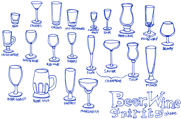
I've always had a fascination with glass containers of all shapes, sizes, colours, and purposes. Chinese restaurants would have those paper placemats that show all the different kinds of cocktails in their specialized fancy glasses -- I loved those as a kid, I'd even bring them home (the placemats, not the glasses :P)! I especially love perfume bottles and I was so pleased to be able to do a couple illustrations for Best Health magazine last winter that showed new fall fragrances.

And that brings me to these bizarrely shaped alchemical apparatuses (apparati?) Such exotic names, shapes, and mysterious purposes. I eventually want to do an illustration based around them, but for now here are the sketches!


Of course, I couldn't leave out this sketch of cocktail glasses, based on those awesome paper placemats. Here in Calgary we've got three different kinds of glasses: Ikea coloured plastic tumblers, Ikea glass drinking glasses, and Ikea mugs. Wouldn't it be nice to have a pousse-café glass filled with liquids of different densities, producing a beguiling rainbow effect? 


Monday, February 6, 2012

Pete Townshend for "A Circus Mind"

Here's my sixth illustration for Ryan W. Cox's "A Circus Mind" book. Check out the other ones here! All the images in the book will adhere to one colour palette, you can see what some of those colours are if you check out the images I've done so far. Prints of this image and more available on my Society6 shop page!

This illustration is for a poem called "Pete Townshend" and is set in swingin' 60s mod London, more specifically Brighton Beach. The background wood texture is meant to resemble the famous boardwalk there. And who can think of The Who without their rock opera "Tommy"? So I incorporated some pinball motifs as well. For some reason I purposely put the red pinball bumpers in front of the wiry bit that snakes around on the left side. I realize it doesn't make sense but for some reason I like it that way! In fact, this entire image doesn't make much sense -- I think illustrating these poems is really freeing me up from being so literal with my illustrations. Feels good!

Townshend is credited as one of the first musicians to really incorporate distortion into music, which is why the Union Jack is cracking while his guitar spits sparks. And lastly, he's best known for this signature windmill move so of course I had to include that!


The initial sketch is pretty sketchy!