Tuesday, December 18, 2012

The Old Cottage for Cottage Magazine

The Old Cottage: Add or Build New? For Cottage Magazine
My favourite thing in the world is repeat clients. Last April I did a series of illustrations for Cottage Magazine and this is my second job for them!

The accompanying article deals with the dilemma of renovating an older cottage versus building a new one. A lot of older cottages don't comply with modern regulations, so altering the building in any way can result in a seemingly endless battle with red tape. 

It was fun to do a split-screen illustration that contrasts the care-free 50s when one's grandparents may have built their cozy cottage and the more stress-filled 2010s (is there an appropriate abbreviation for this yet?). Coca-cola in glass bottles has been replaced with a grande Starbucks coffee. The straight-forward task of splitting cedar shakes for a cottage roof has now become navigating thick binders of obscure zoning bylaws and environmental impact studies. The cars and clothes have changed while the stunning view remains the same!

 And here's the spot illustration:


Sketches!


-- Julia
Portfolio site


Tuesday, December 11, 2012

Grand Rights 101 for Words & Music magazine

Grand Rights 101. Wagner at the opera doing a bit of accounting!
Words & Music magazine is put out by SOCAN, a Canadian organization that handles the licenses of music for more than 100,000 members. The article I was illustrating was a primer on Grand Rights, which are the rights associated to performing music live onstage (musicals, operas, ballet, etc.)

Fresh Art & Design Inc. is a design firm based in Toronto, and they handle the art direction and design of Words & Music. They've also done design work for the University of Toronto, Rogers, and Opera Canada. It's really nice to get to work for a firm that is right in the mix of Canadian arts and culture!

We've got a happy Wagner totting up his receipts backstage after another successful night at the opera -- Because Grand Rights exist to make sure that the creators are adequately compensated for their works. I was originally going to just draw a jumble of musical notes on the paper in the bottom left corner, but I remembered that musicians and composers and other music industry people would be reading the magazine! So I found a page of sheet music that actually had a bit of Wagner on it and used that. I don't know if anyone will notice... But it was fun to do!

Super rough sketch: 

A more refined version:

-- Julia

Tuesday, December 4, 2012

The God of Gelatin on the cover of the Weekly Alibi

gelatin god for the weekly alibi
Now that this illustration's been published, I suppose that means I ought to stop futzing with it :P. For some reason I get a real kick out of drawing food. This is a self-directed piece I did that showcases that wobbly wonder called gelatin, its origins, and its many uses. 

Here's some text I wrote to accompany the illustration: 

Gelatin is a translucent, colourless, flavour-
less solid substance created when collagen is
hydrolysed. Its most common forms are 
sheets, granules, or powder.

One of the oldest forms of gelatin is hartshorn jelly, 
derived from the antlers of stags. Another ancient
source of gelatin is isinglass, made from the swim 
bladders of sturgeon. Isinglass is used to this day 
in the clarification of beer and wine. Gelatin is 
derived from animal by-products although veg-
etarian alternatives do exist. In modern times the 
majority of the gelatin is extracted from pig skin.


Gelatin is a versatile substance with a multitude 
of uses. It is used most commonly as an addi-
tive to foodstuffs, where it can act as a thickener, 
texturizer, or stabilizer. Gelatin is essential in the 
manufacture of film stock and is used extensively 
as a substrate for cell cultivation, as ballistics 
gelatin, and in pill casings, glue, and confect-
ionery.
             

Here's some more of the process work for the piece. And the preliminary work!  


And here's my Umami: The Fifth Taste piece I did last year, in the same "I love drawing food" vein:

It seems like every year I get a hankering for doing a "food, glorious food!" illustration. Here was 2011's:


-- Julia

Tuesday, November 27, 2012

Social Gifting for the Weekly Alibi


Social networking site can help with gifting for the holidays
Facebook, Pinterest, Tumblr, and other social networking sites can help gifters suss out what giftees may desire! Perhaps a little benign cyber-stalking is in order this holiday season :). Link to the Weekly Alibi article. 

And here's some more hand-drawn type I did for the same issue:

Hand-done cursive text

-- Julia


Tuesday, November 20, 2012

Latest Macleans on Newsstands

Paul and Morris Longmire, for Macleans
I've done a number of these back page illustrations for Macleans, but this one was the first time I've done a "The End" piece that's featured twins. Paul and Morris Longmire were inseparable in life. They played together, worked together, bought twin houses next to each other, vacationed together, and tragically died together in a car accident. 

One of their favourite pastimes (apparently that's how it's spelled, I checked! I could've sworn it would be "passtimes" or "pass-times") was cribbage, so I came up with an illustrated frame that incorporated a cribbage board with two tracks. In cribbage the pieces race each other around the track, but in this frame I put the playing pieces in step with each other (as the twins were in life), with details from the brothers' lives along the way. 

They were fishermen who bought a scallop boat together, so I drew a scallop shell containing two scallops to indicate their closeness. The pawns at the top centre show how they were the middle children of six, or could symbolise how they had three children each. I made their twin bungalows Monopoly houses to go along with the board game idea.

And here's the spot illustration that is used in Macleans' iPad app:


-- Julia

Tuesday, November 13, 2012

Sad Republican Elephant for the Weekly Alibi

Sad Republican elephant copes with the results of the 2012 US election
The 2012 US Elections are long over (well, a long time in this super-fast modern world we inhabit) and the results are in. The GOP's wept some tears and nursed a few glasses of chocolate milk. I've heard that phoenixes (phoenices?) rise from the ashes and I wonder if the same applies to pachyderms :P. 

The Weekly Alibi wanted an illustration of the aftermath and suggested the idea of a sad elephant at a bar, but wondered if it would be too cheesy. No way, I thought! Let's make this happen!

Sketch:

Best wishes to my American friends -- Hope the next four years are good to you. 

-- Julia

Tuesday, November 6, 2012

Booksellers Fight the Good Fight: For the Weekly Alibi

bookworm rejecting e-book reader
A fun one for the Weekly Alibi (here's the article). It's about the battle that independent booksellers have been fighting since the creation of e-book technology -- How to be relevant and appeal to customers who in large part have turned to Kindles and Kobos to satisfy their literary needs. 

In a way, it's a companion piece to this illustration I did for Alternatives Journal. That article discussed how the new technologies are innovating the publishing industry. This latest article for the Alibi recounts how booksellers are fighting to retain a piece of that publishing pie. 

 Sketch:

-- Julia 

Thursday, November 1, 2012

Hydrocolloid Pantheon: Gelatin God being inked

Haven't been able to work on this one for a while! I actually inked the whole thing with a tech pen but I thought it looked horrendous. Going back and doing it again with a wee brush and a pot of ink. 

I've also started to consolidate my reserach for the next one in the series... Agar! Derived from red algae with 17th century Japanese origins. Also known as Japanese Isinglass. Used with added nutrients to germinate seeds in a sterile environment. A staple of many Asian desserts. Mmm... 


-- Julia

Wednesday, October 31, 2012

Happy Halloween!

Happy Halloween, everyone! Hope it's spooky and fun and full of seasonally small candy bars :D

Tuesday, October 30, 2012

Band Lottery for the Weekly Alibi

Rock band lottery illustration for the Weekly Alibi
Here's one for the Weekly Alibi, for a band lottery (link to the article) in Albuquerque, in which bands are randomly constructed from individual musicians and play in a concert together. Sounds like a blast!

Aside from a brief stint as a flautist (flutist, flute player, etc.) in elementary and middle school and some choir stuff in high school I'm not very musical at all. Even when I'm working or working out, I prefer podcasts over music. 

I listen to many hours of podcasts during the week, including: The Indoor Kids, Stuff You Should Know, Stuff You Missed in History Class, WoW Insider, WTF with Marc Maron, The Joe Rogan Experience, Talkin' Toons with Rob Paulsen, and Mike and Tom Eat Snacks. There was a time when I'd listen to the old XFM Podcasts with Ricky Gervais, Stephen Merchant, and Karl Pilkington repeatedly, pretty much all the series and seasons. Those are golden!

Any podcast recommendations?

-- Julia

Thursday, October 25, 2012

My nail polish collection

nail polish collection
More make-up sketch stuff! (Here's the rest of it). I thought it'd be handy for me to have all of this in one place so I can see what I've got at a glance. Conclusion? A lot of these look very similar :P. Although the scan can't really show the different shimmery bits and such, and certainly didn't do justice to the fluorescent polishes of the "Outrageous Neons" mini collection I picked up recently. 

I'm still working on that gelatin-themed personal piece -- just thought it might be fun to whip up something quick this week! 

-- Julia

Monday, October 22, 2012

New Macleans illustration on newsstands

Macleans back page illustration
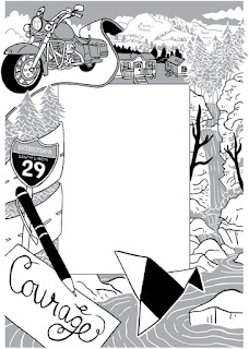
My latest back page illustration for Macleans! The subject is Gloria Taylor, the first Canadian to win the legal right to doctor-assisted suicide. In the end she didn't need to exercise that right (Taylor died of an infection) but having that choice whether she needed it or not was the vital thing. 

When I'm working on these illustrations I often draw from where the person came from and what they did. In this case, Gloria lived in West Kelowna (I found a mountain that is in that area and drew it at the top right). She managed a trailer park (top centre). She loved motorcycles and would visit South Dakota often while riding her Harley (side left). Gloria was known for her beautiful handwriting (bottom left). The origami bird in the bottom right is the logo for the B.C. Civil Liberties Association, which she worked with to mount the case for doctor-assisted suicide. And on the right side is a representation of Hardy Falls, one of her favourite places -- It was her wish to have her ashes dispersed there. 

And here's the spot illustration for Macleans' iPad app:

And sketch. I ended up flipping it because I had the B.C. Civil Liberties Association logo reversed. 


-- Julia

Tuesday, October 9, 2012

God of Gelatin: Giant glorious aspic and industrial uses

Gelatin God: Pagan and Regency and delish!
Click to enlarge -- The pics below, too!

 Nearly done the pencils for this illustration! I've tightened it up in some places and added some of the industrial uses for gelatin: Photographic film, a substrate for cell cultures, and ballistic gelatin. Not to mention the monstrous aspic containing eggs, shrimp, olives, brussel sprouts, and cubes of ham. 

It's been nice to be able to take a leisurely approach to this piece, working in fits and starts and having fun with the little details!


-- Julia

Thursday, October 4, 2012

God of Gelatin -- Work in Progress

God of Gelatin, Regency era and primal. Delicious treats!
(Click images to enlarge.)
Added some gelatin-containing foods to the sketch (counter-clockwise from the far left): Trifle, animal hide glue in a pot, licorice allsorts, gumdrops, jelly beans, and marshmallows. I'm hoping to stick a glorious giant aspic in the back, full of hard boiled eggs and bits of meat. 

And I still have to work in the nymph/fairy/pixie Isinglass. Isinglass is the swim bladders of fish, also used to make gelatin. I kinda think Isinglass is a lovely name for a mystical creature!

Here's my initial post on this sketch, with more details.

-- Julia

Monday, October 1, 2012

The Casual Vacancy by J.K. Rowling, for Macleans magazine

The Casual Vacancy, by J.K. Rowling for Macleans magazine
Click to enlarge
"The Casual Vacancy" is J.K. Rowling's first novel for adults. Needless to say, it's pretty big news! I did this illustration for Maclean's magazine to accompany an article about the book. The issue should be on newsstands now.

This is my first colour illustration for Macleans, so I was super excited to do it! Here are some of the other pieces I've done for them. 

The challenge for this piece was that the contents of the book were a closely guarded secret. All I had to work with was the same blurb that was making the rounds all around the internet:

"When Barry Fairbrother dies in his early forties, the town of Pagford is left in shock.
Pagford is, seemingly, an English idyll, with a cobbled market square and an ancient abbey, but what lies behind the pretty façade is a town at war. Rich at war with poor, teenagers at war with their parents, wives at war with their husbands, teachers at war with their pupils…Pagford is not what it first seems. And the empty seat left by Barry on the parish council soon becomes the catalyst for the biggest war the town has yet seen. Who will triumph in an election fraught with passion, duplicity and unexpected revelations?
A big novel about a small town, The Casual Vacancy is J.K. Rowling’s first novel for adults. It is the work of a storyteller like no other."

-- taken from Little, Brown Book Group's site, the UK publisher of the book. 

There's definitely some stuff to work from there, but key details such as time period aren't mentioned. Nothing is known about the characters, particularly their physical appearances. Luckily I was able to dig up a Guardian article on the book that gave me some more info: Barry's death deeply affects a young girl who'd befriended him. The book is set in the present day and class struggle is central to the book. 

The art director and I knew that the figures couldn't be too prominent and that the town ought to take centre stage, considering it's the bit in the blurb that is described the most. But there is no actual Pagford! I found this article by the Independent about a town called Kelso that has all the elements required to qualify as a representation of the fictional setting: cobbled market square, ancient abbey nearby, and about the right population. So I found photos of Kelso's old abbey, town hall, and town square and used them to inspire me!

I wanted the whole thing to look foreboding and mysterious, with conflict boiling under the surface. Looks like a storm is coming to Pagford! Better batten the hatches :). 


A Casual Vacancy inked sketch
Inked, pre-colouring. At this stage I was a little concerned because without the grey tones knocking the town into the distance the whole thing looks jumbly. 

Tonal sketch. 

A Casual Vacancy, work in progress
Transition stage between the pencil sketch and the tonal sketch. I tightened up the pencils using my Wacom tablet and added a lot of detail.

A Casual Vacancy, pencil sketch
Initial pencil sketch. The basic idea is there, but I fiddled a lot with the scale of the buildings in subsequent sketches. And where's the girl!?

-- Julia

Thursday, September 20, 2012

Hydrocolloid Pantheon

I love drawing food. The shapes and colours appeal to me very strongly and I don't really know why. My personal pieces tend to include food, whether it's the mad tea party in Alice in Wonderland or an info graphic  / tribute to umami, the fifth taste.

I was thinking of doing a series based on the other four tastes (still might!). But while I was doing my research I started getting really interested in hydrocolloids -- aka gelatin, agar, pectin, gum arabic, etc. Such a versatile substance, and derived from so many sources! Gelatin is made from bones, horns, hooves, and skin. Agar is extracted from seaweed. Pectin is from fruits. Gum arabic is from the acacia tree. Starches count as hydrocolloids too, which means that just about any starchy plant (corn, potato, wheat...) can create the stuff. There's even a kind of gelatin called isinglass which is derived from the dried swim bladders of fish! Basically, you can create this jiggly-wiggly substance from just about anything.

And humans have been using hydrocolloids for ages. The ancient Egyptians used wheat starch as glue, the Romans used it in creams and to thicken sauces, cooks in the Middle Ages knew how to create a meat-based jelly as a foodstuff, and aspic has been used for ages to preserve meat.

Hydrocolloids are used in all types of foods, confectionery, glue, as a substrate for cell cultures,  as wound dressings, in photography... The list goes on and on. And so I've arrived at my next personal series. The first of which is Gelatin.

Two of the oldest sources of gelatin are hartshorn (deer antlers) and isinglass (the fish swim bladders). So my first deity in the Hydrocolloid Pantheon is a pagan god of sorts, with a Regency period flavour. There is such a contrast in  the primal, visceral origins of gelatin (yes, you can use guts to make gelatin too!) and delicate, pretty creations such as trifles and marshmallow peeps that I wanted the Gelatin God to be both animalistic and rather proper. And nothing's more proper than Jane Austen dishing up a heapin' helpin' of aspic!

During the Industrial Revolution (the Regency period happened somewhere in there) gelatin was a by-product of the mass production of animals that factories were now able to accomplish. It didn't take long before enterprising souls went to work marketing this jiggly waste product to consumers to make some extra cash! Here's an interesting article about aspic. From the Guardian. Naturally :P.

Also, I think I went with Regency because when I think of a prim satyr-type figure I think of Mr. Tumnus from The Lion, the Witch and the Wardrobe and James McAvoy played Tumnus and he also starred in a Jane Austen movie called "Becoming Jane".

He's holding a beer because isinglass is still used in the production of wine and beer. I'm planning on drawing a little nymph/fairy/pixie called Isinglass somewhere in this illustration. Not to mention mountains of gumdrops, jelly beans, and other delicious things :).

-- Julia
Portfolio site

Monday, September 17, 2012

Closet Case for Rhode Island Monthly

Here's an illustration I did for the Rhode Island Monthly, which features stylist Jill Marinelli's advice on some essential pieces that should be in every woman's wardrobe. I had a lot of fun working with the paper doll idea -- When I was young I LOVED paper dolls. Still do! The copy in this layout is just filler, if you want to read the actual article Jill has posted it on her site.

I couldn't resist making the clothing match up perfectly with the body of the figure. Here are a some of the looks that can be created from the pieces I illustrated:


Sketch!


Here are the other sketches I submitted:

This sketch showcases a week's worth of outfits that could be created with the wardrobe essentials. 


Here's a rough portrait of the stylist. I drew her climbing up a rope made of knotted clothing to help her client!


This sketch takes the wardrobe basics mentioned in the story and displays them on a clothesline.

This sketch has a lady shipwrecked in her chaotic walk-in closet, signalling for help. 


And this one plays with the idea of an actual "closet case", where the stylist is helping her client photograph and catalogue her clothing, much like a detective would do to solve a mystery. I made the body copy of the article look like part of a case file!


-- Julia

Friday, September 14, 2012

Two more EGA portraits and some adjustments

Click image to enlarge

Did up two more Colonel's Bequest-style portraits today! Also added more shading to the ones I already had. The shading helps define the shapes a bit more. Still not 100% set on any of these -- Work in progress :). 

The first three characters are pretty standard, but the next two sort of hint at the setting of my game. I want to do a "cozy" type murder mystery and set it in a lodge in the Canadian woods! That's why one of the rooms I created has a rustic look:

Click image to enlarge

I have a notebook where I've been jotting down story ideas and character stuff. I have a vague idea of how I want it all to play out. It's just a matter of setting the time aside to do it!

Here's the other old school game stuff I've done. 

-- Julia

Tuesday, September 11, 2012

The Weekly Alibi's 2012 Haiku Contest

It's that time again! September means Alibi's Haiku contest has come around, and happily I was asked to provide art for the occasion. Last year I did a cover for the contest, this time it was an interior page. This year presented a particularly interesting challenge, as most of the page was taken up by the winning haiku poems. 

I decided to go with a couple of arrangements of spot illustrations along the top and bottom of the page, each spot inspired by the eclectic nature of the poems. There were entries about Mars, singing cicadas, polka-dot underwear, baked beans, homeless Muppets, and Mitt Romney. Plenty to draw from (pun?)!

I'm not much of a poetry person, but haiku is one of the forms I can really get behind. 5-7-5 syllable structure. You work within that restriction, and presto! You've got yourself a haiku. 

Sketch with the page layout:

Haikus aren't that hard.
Five syllables, seven, five.
Do that and you're set!

-- Julia